Let's Talk Curb Appeal
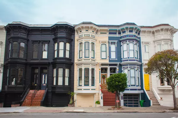
When staging to sell, your home’s exterior is just as important - in some ways, even more important - than the interior. Curb appeal is crucial, as the front of your house is the first thing buyers see, so be sure to put your best foot forward. Mulched landscaping, a cheery welcome mat, and a tasteful wreath give the right first impression! Here are a few of our stagers’ favorite ways to add instant curb appeal: Be sure there is a clear view of the house from the street. Trim back any overgrown trees or hedges that may be blocking the view of the front facade. Buyers will not purchase what they cannot see! Make the most of your outdoor space! Mow the lawn in the spring, summer and fall; rake all leaves in the fall; shovel all walkways and driveways in the winter. Update your house numbers to make sure they are visible from the front and in good condition (as well as your mailbox). It’s a good idea to power wash exterior siding, porches, decks, walkways and driveways. Dependent upon season, add a pop of color to the front landscaping - whether it be sprucing up your flower beds, adding a charming wreath, potted plants, or bright foliage is a simple way to make sure you draw those buyers in. The backyard is a continued living space and ultimately where you will entertain guests outdoors. Set the scene as if you are having friends and family over for a big outdoor BBQ. Continue landscaping and lawn care the same as the front of the home and dress up your yard with a table and chairs with a propped up umbrella and some brightly potted plants to add a pop of color (if the season allows). Remove any trash cans, recycling bins, garden tools, and yard equipment out of view. Ideally, store these items neatly inside the garage or shed, out of sight for buyers viewing your home in person and online. Check out the homes below for some curb appeal inspo!

Kitchen Trends Through the Decades
Interior design trends come and go with every decade, but the kitchen is where the most notable changes have occurred. Long gone are the days of retro refrigerators and black and white tiled floors. Journey with us through the decades as we take a look back at the most popular kitchen design trends over the past 70 years. 1950’s | 50’s kitchens are often remembered as post-war candy-colored dreams. Styles included bubble and rounded shaped appliances, multi-purpose appliances, linoleum floors, and pastel colored cabinets. Glittery red kitchen chair cushions were seen in many eat-in kitchens, boldly playing off the popular black and white square floor pattern. A notable staple of the 50’s kitchen was the pull-out ironing board cabinet. 1960’s | 60’s kitchens became more casual design-wise, as updated appliances became the focus. This was the decade where dishwashers were first introduced. Eat-in nooks, breakfast bars, and wood cabinets were all the rage. Warmer and richer hues became much more prevalent than the bright colors of the 50’s. 1970’s | The 70’s introduced the microwave which was such a big installation that the design choices of the 60’s remained for most of the 70’s, as the emphasis was on this appliance specifically. Wood cabinets continued and home-owners began matching the wood with wood-paneling, wood furniture, and wood fixtures. Warm browns remained as the overall look of 70’s kitchens, with fun pops of color found in colored-cookware. 1980’s | The 80’s was a turning point for women in society- which had a direct impact on the kitchen design of the era. Prior to the 80’s, many women stayed home and made the kitchen their domain. In the 80’s, women overwhelmingly began working- resulting in the kitchen becoming a place to interact with family at the end of the work day. This was the beginning of the “open floor-plan.” Expansive islands and breakfast bars were implemented providing views into the larger living areas of the home. Perhaps the most recognizable (and now detested) trend of the 80’s was the Euro-style cabinet, a white laminate front with a light-toned wooden band at the top to act as an integrated handle. White and beige began taking over the natural brown hues of the 60’s and 70’s. 1990’s | The white color palette of the 80’s continued into the 90’s but the style shifted from sleek to slabby-chic. Granite was a new material, and quickly became the most popular choice for countertops. 90’s kitchens boasted dark granite countertops to contrast with the white cabinets and appliances. Design choices included: ornate paneling, ceramic tiles with country flourishes, and wood cabinets (either in classic light brown or painted white). One of the most cringe-worthy and iconic trends of the 90’s kitchen is sponge painted walls- a cost effective “stucco.” Themed kitchens were all the rage as well. It wasn’t uncommon to stumble upon apple themed kitchens or grape vine and wine themed kitchens. Oh, and wallpaper, lots of wallpaper. Some homeowners even used wallpaper as their backsplash instead of classic tile. 2000’s | With the rise of HGTV, kitchen design was elevated in the new milliennium. The new aesthetic was industrial with white appliances being replaced by stainless steel. Wood cabinets remained, but were usually stained a darker brown or cherry color. High contrast kitchens became a popular choice, with dark cabinets balancing lighter countertops. Another popular kitchen design from the 2000s was Tuscan style- featuring Italian inspired stucco and an abundance of deep reds and tans. 2010’s | Reclaimed wood floors, subway tile backsplashes, farmhouse sinks, and brass hardware were popular in the 20-teen’s and added a touch of timeless vintage charm. Open cabinetry was often seen instead of classic closed door cabinets. Neutral tones were often deployed, although people favored cooler tones like grays and blues with high-contrast pops of navy. Blue kitchens made a huge splash in the late 2010’s. Stainless steel remained the number one choice for appliances. Low profile gadgets like microwave drawers and under-cabinet lighting grew in popularity. But, the most memorable trend of the 2010’s was the Instagram-worthy kitchen jungle. People really loved their plants in this decade. 2020’s | SOLD by Bob + Tracy Lucido 4010 Chatham Road, Ellicott City MD We’re just barely into the 20’s, but certain kitchen features have already begun to steal the spotlight. Two-tone cabinets are making waves in the interior design industry. Many kitchens boast either different colored top and bottom cabinets, or island cabinets that contrast with the rest. Also very popular is infusing wood into the design of the kitchen- whether it be wood cabinets, shelving, or decor. Double islands, ceiling-high cabinets, and ceiling-high backsplashes behind the hood vent are common design choices for the 2020’s kitchen. As popular as white kitchens have been for the past 30 years, color is taking over. Blue cabinets ruled the late 10’s, but now green cabinets are coming back in style. Instead of the avocado pastel-green we've seen in the past, emerald green is now making a splash. Get ready to see lots of darker colored cabinets, gold and brass appliances, and black metal fixtures. Source

Pantone Color of the Year 2022
Introducing Pantone’s selection for Color of the Year 2022: PANTONE 17-3938 VERY PERI “A New Pantone Color Whose Courageous Presence EncouragesPersonal Inventiveness and Creativity.” Pantone’s ability to forecast color trends is a marketing force that has influenced product development and purchasing decisions in multiple industries for the past 23 years. You can be sure to see Veri Peri used throughout the year by designers from all industries. Within the real estate industry, interior designers and home stagers incorporate the color into paint, fixtures, cabinets, and decor choices. Pantone experts arrive at a selection each year after searching the world for new color influences. This can include the entertainment industry, art, fashion, design, lifestyles, socio-economic conditions, technology, materials, textures, and effects that impact color. In 2021, Pantone chose Illuminating Yellow and Ultimate Gray as the Colors of the Year to highlight how different elements can come together to express an uplifting message of hopefulness, in response to the global pandemic in 2020. This year, Pantone took a similar approach, choosing Veri Peri to comment on these transformative times. Veri Peri, according to Pantone, is “a symbol of the global zeitgeist of the moment and the transition we are going through.” Pantone noted as we emerge from a period of isolation and further descend into a dynamic virtual world, we can create new color possibilities. Veri Peri derives from current trends in gaming and the expanding popularity of digital art. The color illustrates the fusion of modern life and the digital world. Source
Categories
Recent Posts


